

Seren
A Simplified Approach to Mindfulness and Making Meditation Personal and Effortless
Timeline
2 Months
My Role
UX Designer
UI Designer
Tools
Figma, FigJam
Maze, Zoom
Overview
This project was a collaborative effort by a team of three, focused on exploring creative solutions for real user problems. Our goal was to design an intuitive meditation app, and I also took the opportunity to refine my end-to-end design process and deliver a meaningful, user-first experience.

Introduction
With the increasing demand for self-care tools, many individuals struggle to find meditation apps that fit seamlessly into their daily lives. As a result, they experience inconsistent usage, slow progress, and frustration with generic, one-size-fits-all solutions.
To overcome this challenge, we introduced a streamlined interface and personalized features that empower users to track their mood, personalized their sessions, and receive timely nudges. These enhancements aim to reduce frustration, drive consistent engagement, and ultimately improve the journey toward mental well-being.
The Problem
To tackle the problem, we needed a deeper understanding of why users feel overwhelmed. Here’s our findings after conducting comprehensive research:
Users feel overwhelmed by cluttered interfaces.
Gamification tools like streaks create unnecessary pressure.
There’s a strong demand for simple, personalized experiences.

Only 4% of users open mental health apps daily.
71% of mental health app users disengage within 90 days and retention remains a major challenge.
But What Cause This Problem?
Retention is a major challenge for mental health apps. Studies show that while install rates are high, only 4% of users engage daily, and 96% abandon the app within 30 days. A review of 62 mental health app studies found that 71% of users disengage within 90 days, mainly due to a lack of engagement features, low barriers to exit, and technical difficulties. Interestingly, users who received compensation were 10 times more likely to stay engaged.
https://www.jmir.org/2022/4/e35120
https://pubmed.ncbi.nlm.nih.gov/31573916/
These findings emphasize the need for personalized incentives, gamification, and ongoing support to improve long-term retention.
What We Learned from User Interviews👩💻
To deepen our understanding of user frustrations and preferences, we interviewed 6 participants. This method provided important insights into users’ needs.

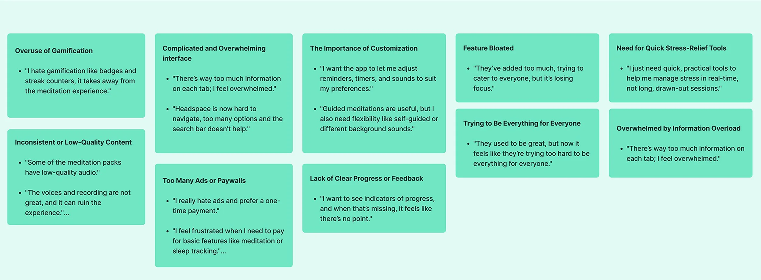
Users prefer minimal, user-friendly interfaces with well-categorized content and quick access to practical features. They value short sessions (10–15 minutes) that fit into their busy schedules, focusing on areas like stress relief, focus, and sleep improvement. Personalized tools, such as tailored plans, progress tracking, and gentle reminders, are highly desired. Users also appreciate badges and unlocking new content as motivation.
Insights from Secondary Research🔍
We start this phase, by doing an extensive research through online reviews (App store), Reddit, relevant articles and other online resources. We gathered and analyze data to help us understand what truly users need and what are their frustrations!
Some of the users pain points that we’ve found online
Analyzing Our Competitors in The Market👩💻
For gathering further information, we decided to analyze our competitors by downloading and testing competitors apps, gathering screen shots, identifying their features, motivational tools and overall user experience and visual style.


Understanding Our User Through Persona👤
After finishing the research phase, we created a persona to represent Seren’s target users. Emily, represents a busy professional who struggles to maintain a meditation routine due to overwhelming app designs and lack of personalization. Her needs guided key design decisions for Seren.

How Might We Statements⁉️
After gathering research data, we start the next step by asking HMW questions to explore potential solutions to our users problems and make it more actionable. Here are HMW statements:
1
How might we encourage users to build a consistent meditation habit and reduce app abandonment?
2
How might we personalize the meditation experience to better align with users' unique goals and preferences?
3
How might we incorporate engaging features that motivate users without overwhelming them?
What We Could Offer 💡
After some sessions of brainstorming and listing our ideas for the possible features, we narrowed down our options, and the following items are our selected ones, which we believe will provide the most value to users, enhance engagement, and align with their needs and preferences.
One-Tap Access to Sessions
AI-Powered Personalized Meditation
Subtle Badge Rewards
Reduce Complexity and Choices
Easy-to-Use Mood Tracking
Minimalistic UI
Calming colors and gentle animations
Design Process✒️
The design process started with rough sketches to map out each screen and test basic interactions. Once the overall flow became clear, we focused on refining the details, ensuring a seamless and intuitive experience.
Whenever we faced design challenges, we explored multiple solutions by studying references and brainstorming alternatives. For instance, while designing the mood check-in screen, we researched how other apps visually represent emotions and sketched various layouts. This helped us create a design that was both visually engaging and easy for users to interact with.


Initial High-Fidelity Designs and Iterations✒️
After creating initial wireframes in Figma, we create a more high-fidelity prototype. This allowed us to do quick heuristic evaluations and iterate based on our findings. We also did some sample user testing with our friends and family and use their feedback for further iterations. Here’s a few of user’s feedbacks :

Key Mistakes We Identified⛔
Placing the "Keep Going" Section on the Homepage
Our intention was to motivate users with progress tracking and reward systems, but placing it front and center on the homepage inadvertently created a sense of pressure rather than gentle encouragement. Users felt it was demanding rather than supportive, which contradicted our goal of a low-pressure meditation journey.
Too Many Elements Competing for Attention
The homepage contained multiple sections(progress tracking, mood check-ins, plans, and navigation) which created visual noise and overwhelmed users, detracting from the app’s intended calming effect.
Overcomplicated Layout for the User’s Plan
While providing a structured plan is valuable, the design felt cluttered and confusing, making it difficult for users to understand their next steps at a glance. This lack of clarity led to frustration rather than seamless engagement.
Missed Opportunity for Personalization
While the app welcomed users with their name, it lacked deeper personalization elements, such as recommendations based on mood or past activity, which could have made the experience feel more tailored and meaningful.
Lack of Visual Hierarchy
Important sections such as mood tracking and meditation plans did not stand out enough, leading users to feel lost when navigating the homepage. Clear prioritization of content was needed to improve the overall user experience.
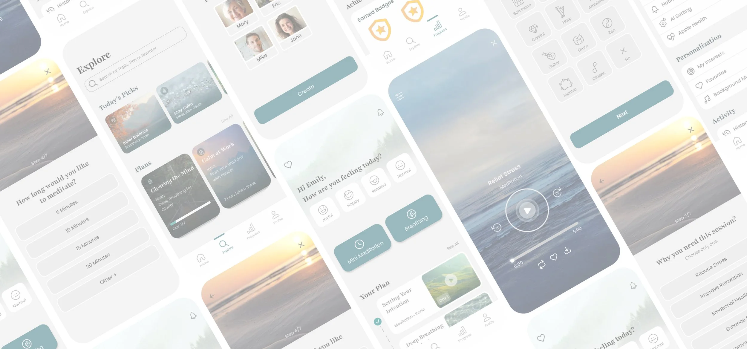
Final Design🌟
The final design of the Seren meditation app features a clean and intuitive interface, prioritizing tools like mood check-in and personalized daily plans. With quick-access buttons for high-demand features and gentle progress tracking, the design ensures a seamless, stress-free user experience tailored to individual needs.

See the Prototype in Action
Lessons Learned💫
Collaboration Skills
Working as part of a team on this project, helped me refine my communication and collaboration skills. Sharing ideas, giving constructive feedback, and aligning on a shared vision taught me the value of teamwork in a design process.
User-Centered Design
Understanding user needs and frustrations was key to shaping Seren’s core features, like mood check-ins and personalized daily plans. This reinforced the importance of empathy and designing for real-world problems.
Progress Over Perfection
One of my biggest personal growth moments was learning to balance perfectionism with progress. I realized that getting feedback on early designs, even when they weren’t perfect, was far more valuable than holding back and waiting for a polished product.