


Overview
This case study documents the end-to-end redesign of the Dallas Flower Florist website, focusing on improving usability, navigation, and customer trust in the online flower shopping process and transform the existing website into a modern, intuitive, and user-friendly platform.
Identifying Problems & Challenges
The Dallas Flower Florist website suffers from complex navigation, outdated design, and a frustrating checkout process, making it difficult for users to find and purchase flowers easily. These usability issues reduce trust, lower conversions, and negatively impact the overall shopping experience.

Research Insights - Users Pain Points

“I just wanted a nice bouquet for my mom’s birthday, but I had to scroll through so many options without a way to filter them. It took way longer than expected.”

“The pictures looked great, but when the flowers arrived, they didn’t match what I saw online. I wish I could see real customer reviews before ordering.”

“I was in a hurry, but the checkout process made me fill out so many unnecessary details. I almost gave up and ordered from another site.”

Heuristic Evaluation Findings
Our heuristic evaluation revealed fundamental usability flaws affecting navigation, checkout, and user engagement.
1-Complex Navigation & Filtering
The website’s category structure was overwhelming, and users had no way to filter flowers by type, price, or occasion.
The website’s design feels outdated and lacks a modern, cohesive aesthetic. Users may perceive the brand as less trustworthy or outdated, leading to higher bounce rates.
2- Outdated Aesthetic
Low-quality images and vague descriptions made it difficult for users to judge flower freshness. Site lacked customer reviews , a key trust-building feature in e-commerce.
3- Lack of Trust
The use of bright red, green, and white lacks proper contrast, making text difficult to read. Some sections have low contrast between background and text.
4- Readability Issues
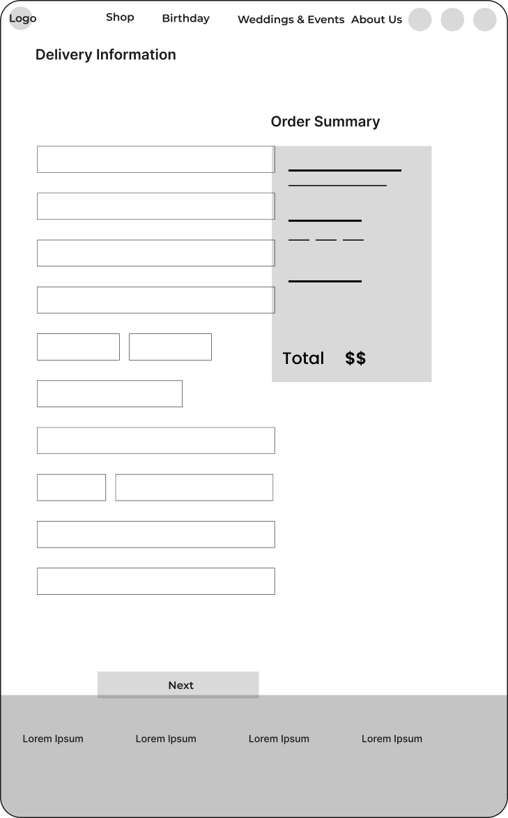
The checkout required too many unnecessary fields, lacked a delivery scheduling option, and didn’t display security trust signals.
5- Complicated Checkout Process
No clear prioritization of elements, causing call-to-action (CTA) buttons to blend into the design. Users cannot quickly distinguish primary vs. secondary actions.
6- Lack of Clear CTA Distinction


Our User Persona


Card Sorting - Structuring a More Intuitive Experience
To improve navigation and product discoverability, we conducted a card sorting exercise to understand how users naturally categorize flower arrangements. This helped us restructure the website’s information architecture, ensuring that users can find what they need quickly and effortlessly.


Sitemap - Building a Clear & Scannable Structure
After analyzing user behavior through card sorting, we created a sitemap to establish a clear, intuitive navigation structure. This ensures that users can effortlessly browse, find products, and complete purchases without frustration.


Sketching- Visualizing the User Experience
Before jumping into high-fidelity wireframes, we started with low-fidelity sketches to explore different layout possibilities and ensure the new design prioritizes clarity, usability, and accessibility. Sketching allowed us to quickly iterate on ideas and focus on key improvements.


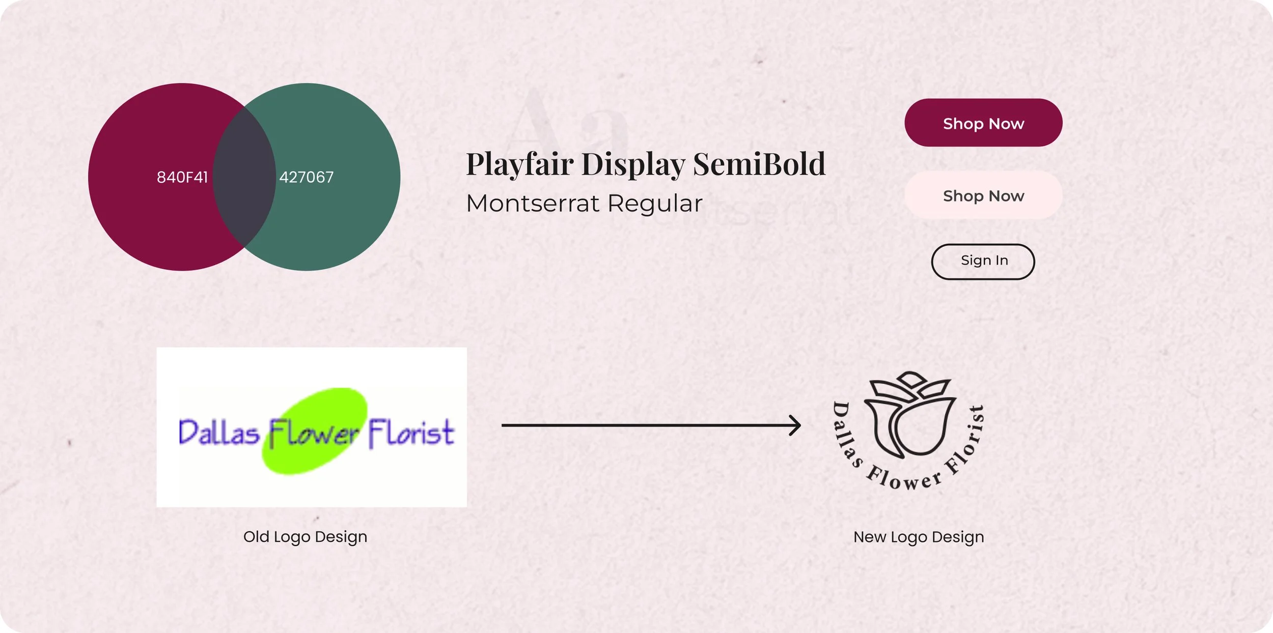
Visual Identity- Creating a Cohesive and Trustworthy Brand Experience
A strong visual identity enhances user trust, improves readability, and ensures a consistent brand experience across all touchpoints. For the Dallas Flower Florist redesign, we focused on modernizing the color scheme, typography, and UI elements to create a more elegant, inviting, and user-friendly experience.

Final Design - Bringing the Vision to Life
The redesigned Dallas Flower Florist website now features a modern and clean aesthetic, with a sophisticated color palette, improved typography, and refined layouts, creating a more inviting and visually balanced experience.
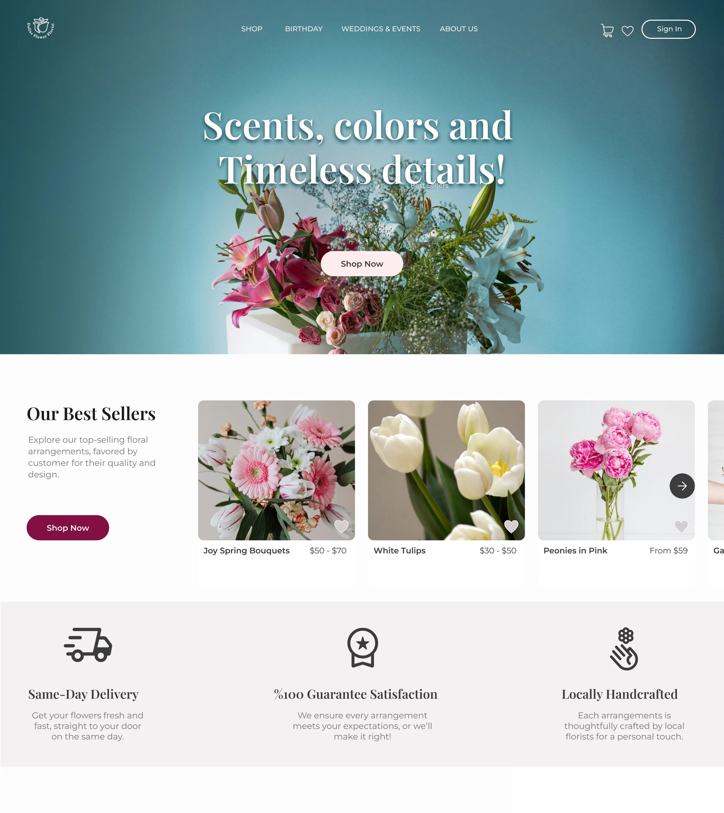

Provide a welcoming and professional first impression while showcasing key benefits to users and highlighting business values.


Organized display of diverse product categories to encourage exploration.
Providing clear calls-to-action like "Shop Now" buttons for easy navigation to specific categories
Build trust and credibility through customer feedback. Reassure users about the quality and reliability of the business.

Provide effortless navigation, ensuring users can explore the website without confusion.
Allows users to explore subcategories seamlessly. Categories like "Shop," "Birthday," and "Weddings & Events" help users find what they’re looking for quickly.

Organized filtering options (price, occasions, flower type, color) for easy product discovery.
Help users find the perfect bouquet effortlessly.


A comprehensive and visually engaging product page to provide all necessary details for informed purchasing.
A bold "Add to Cart" button ensures smooth progression toward checkout.
A Closer Look at The Prototype

Key Lesson Learned
This redesign project taught me the importance of blending functionality with aesthetics. Beyond just improving usability, I discovered how modern design elements like clean layouts and intuitive navigation significantly enhance user trust and satisfaction.
By focusing on user-centered design principles and leveraging user feedback, I strengthened my problem-solving and decision-making skills. The experience underscored how even small improvements in UI and UX can leave a lasting impression on users.